Why grey?
Every year, the Pantone Colour Institute (a global team of colour specialists), based on in-depth trend research, selects a shade that will symbolically set the creative direction for projects designed and implemented in the following year. And so, in 2018, ultra-violet reigned supreme; in 2019, coral; and in 2020, classic blue. In January this year, news spread around the world of the colours selected for 2021. They are: light grey and sunny yellow. This choice has a deeper meaning and is a response to the new reality – in these difficult times, linked to the spread of the coronavirus, these colours are intended to evoke a sense of comfort, calm and a surge of positive energy.
How can you use greys and yellows in your home?
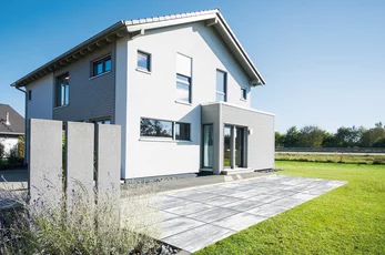
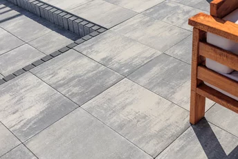
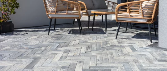
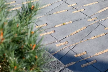
One very practical method for using colours correctly in design is the proportional distribution of dominant shades (the 60:30:10 rule). This means that 60% of the design should feature the dominant shade, 30% the secondary shade and 10% the complementary shade. So, if you’d like to suggest a trendy solution to your client, you could recommend, for example, using pavers or slabs in shades of light grey (e.g. Polbruk Magna
,Lamell
,Oland
,Metrik
orExa
). The space would be enlivened by yellow accessories – e.g. garden textiles or patio furniture. You could appeal to plant lovers with flowerbeds or pots of yellow flowers (spring: yellow tulips, crocuses, forsythia; summer: sunflowers, zinnias; autumn: chrysanthemums). The final group (10%) should consist of a range of complementary shades: e.g. black or gold, silver, white, or natural wood colours (furniture frames, stands, lanterns, street lamps and other decorative elements).
Grey for years to come
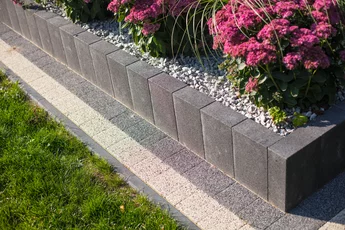
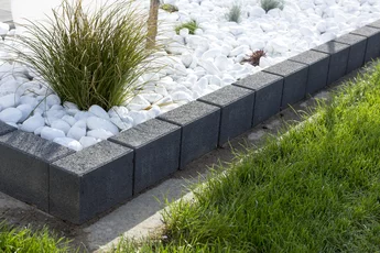
We cannot rule out a situation where a client asks you: ‘Right, but next year other colours will be in fashion, so what then? Don’t worry! Grey is timeless. Even if the Institute chooses a different colour of the year, grey will always, regardless of trends, delight with its elegance. It is such a versatile colour that it can be paired with a whole range of other colours: warm and cool, muted and bold, matt and glossy. What’s more, if grey appears, for example, on a terrace in the form of slabs, pavers, steps or concrete edging (which are highly resistant to weathering), it will be a pleasure to look at for many years to come.
Harmonious combinations
Have you already managed to convince the client to go for grey? Well done – you know your stuff! But the next challenge lies ahead, because after all… grey comes in many shades. Light grey, graphite, steel,nerino
,ritmo
, basalt,alpen
,inez
,ardo
– which one is the perfect shade? How should they be combined? Can they be combined in a single design? The range of Polbruk
products available in shades of grey is truly extensive. They can be combined with confidence – based on similarity. Such a combination is known as monochromatic – that is, a combination of several shades of a single colour with a similar tone. Putting theory into practice: the Polbruk
Oland
slab in the colournerino
will be beautifully showcased thanks to theHestra
palisade in a steel or graphite shade. The driveway created usingExtrano
slabs in steel will be complemented by a
light grey Treo edging
.
A few words on
colour
Colour theory is a subject that is no stranger to your industry. Expanding your knowledge in this area is sure to bring you many benefits. The main point is situations where a client will want to treat you as experienced advisors, creators of outdoor spaces – and will ask for advice on choosing the colour of pavers or slabs. After all, it is you who actively participate in many projects, talk to people, and observe their needs. You know best what trends are prevailing on properties and... why grey is a universal and striking solution